Curriculum in Medical Education

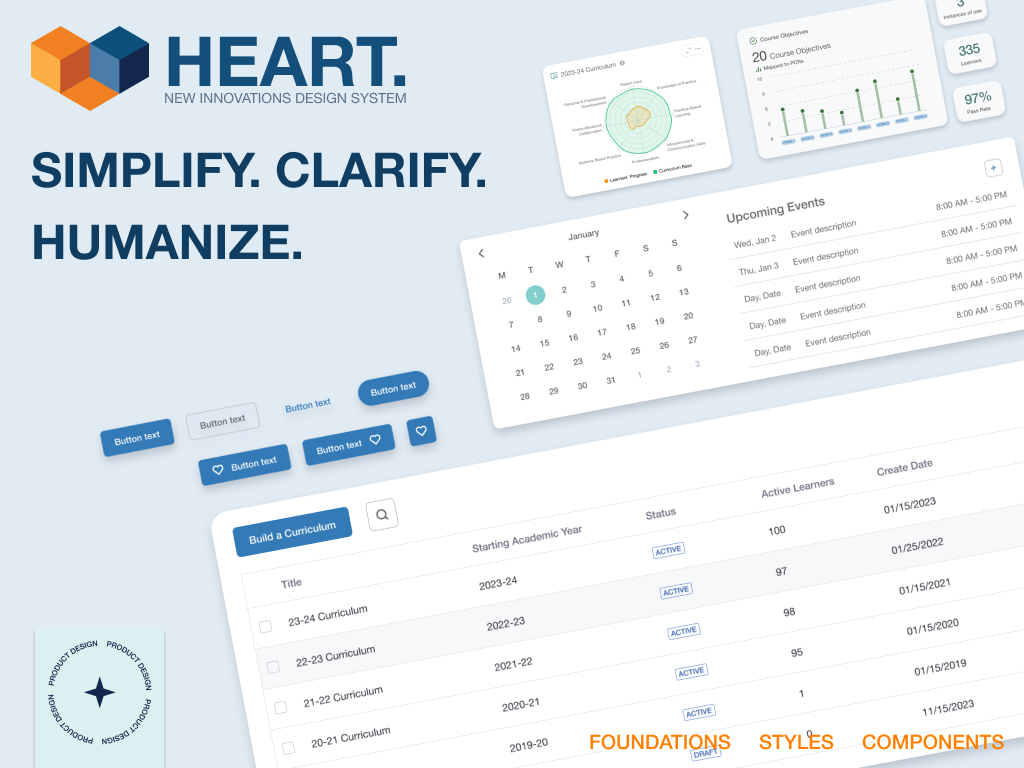
Building a design system of efficiency and innovation.
Create structure and standards with a system that fosters efficiency for designers and engineers in addition to innovation. Make the system easily accessible for use.
I created a team, known as the “Pattern Library Society,” consisting of research, design, and engineering to take on this task. By breaking down the challenge into design, building, and delivery, we were able to lay a foundation for the first version of the HEART Design System. By collaborating with different areas of product development, we essentially have a knowledgable group, a guild if you will, that is disbursed through the product teams that hold development to these standards.
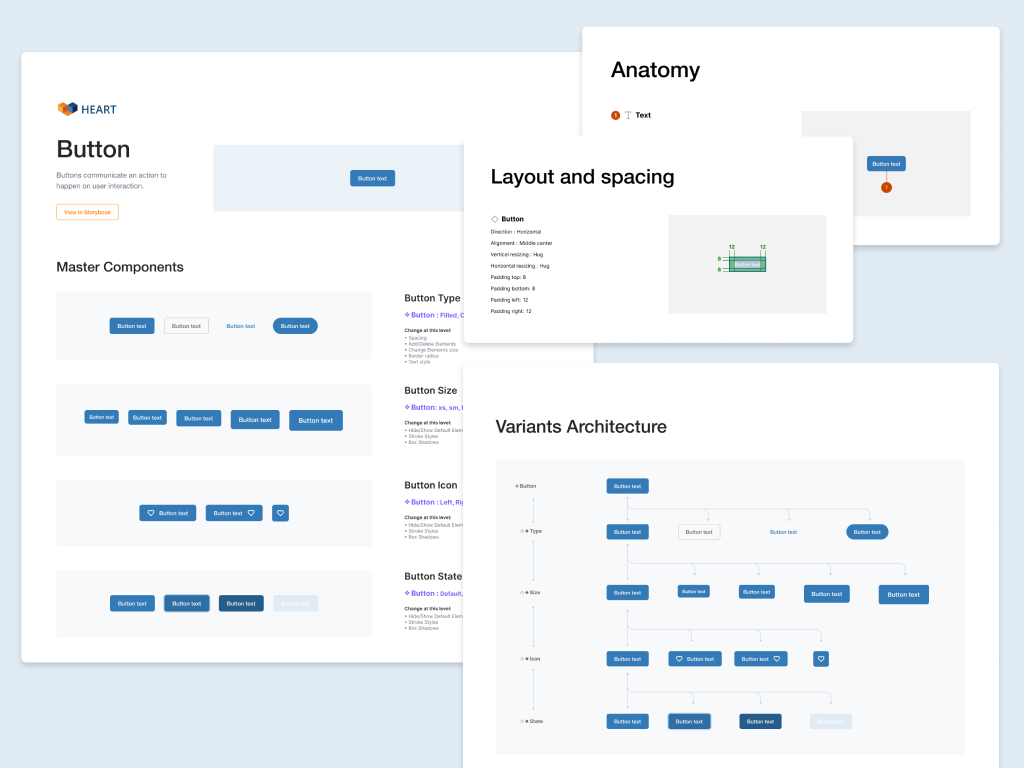
Our first steps were to look at upcoming build cycle work that would need components so we could work on those first. I created a list and an interactive system of status for all components and we began working from there.
Next, we created design tokens for our software’s colors and fonts/sizes. Then I started building design components in figma, making that available for all to use. Once the components were complete, a “ready for development” status was applied.
The system of status was very important because the Pattern Library Society was not solely dedicated to just building the design system. In fact, the group was founded on seeing the problem with a lack of a cohesive system and set out to solve it. So whenever there was a free moment, we looked at our list and worked on what we could.
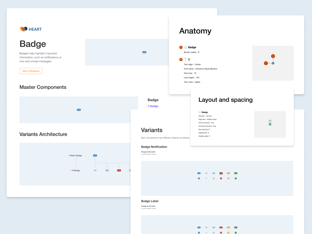
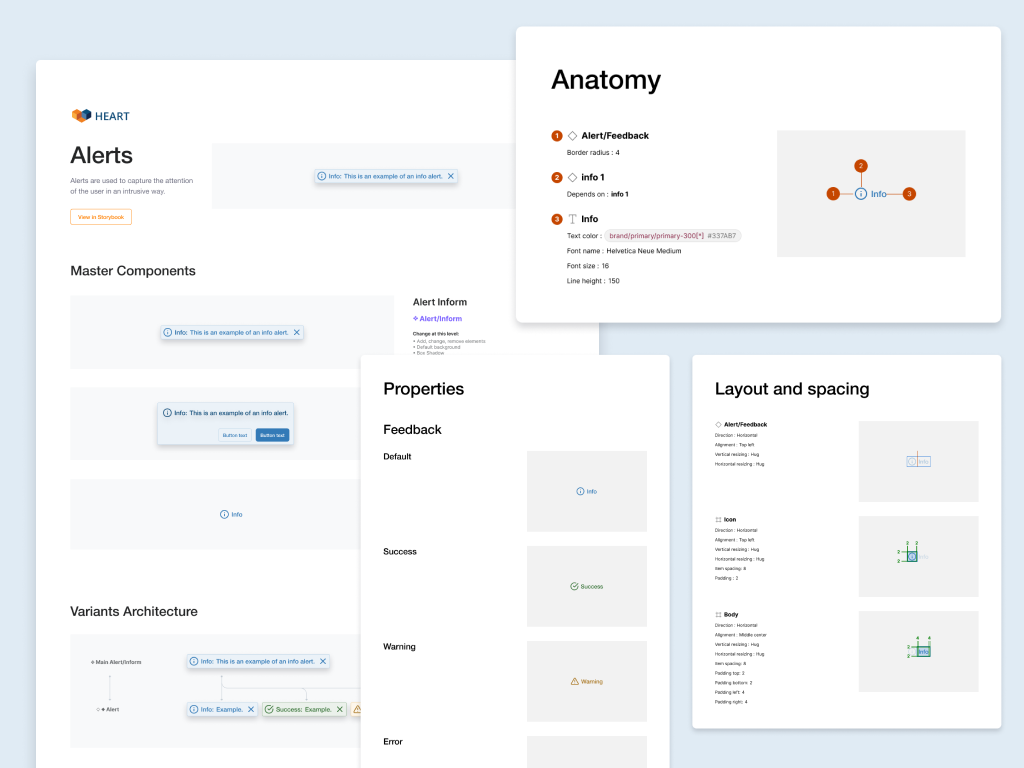
With access to the figma design system, engineers were able to see all of the specs of a component and build it. Figma’s comments and a slack channel became key to our asynchronous approach to building. It allowed for any questions to be captured in the moment of building.
The team chose Storybook to be the home for engineering to locate and use the components built. Engineers played the key role in populating the storybook site with everything needed for fellow engineers to use. On the design side, I added the storybook link of each component and added it to the figma file so it was just a click away.
It’s easy for a design system to become a ghost town (credit goes to Dan Mall for that term). We, for one, have fallen to that ghost town in the past, for this was not our first attempt but one of numerous attempts at a design system that product would ACTUALLY use. What helped us reach a positive outcome was collaboration and delivery. We were able to accomplish a foundation of the HEART design system in about 4 months. Long hours of designing after my individual team commitments were done for the day. They were worth it. We surveyed engineers who had a chance to work with HEART and received feedback of “this reduced my build time by 85% to 90%” and “I can now focus on innovating the engineering instead of worrying about building components for it.” To improve the HEART Design System, we created a slack channel to capture feedback easily since it’s the one peice of communication everyone has open. The Pattern Library Society meet weekly to review that feedback and keep building up this system.
When UTHealth Houston moved from a homegrown residency management system to New Innovations’ residency management system, they contracted us to build a supplements system to manage extra money given to residents of their programs. The feature would also work with the current financial feature in the software suite.
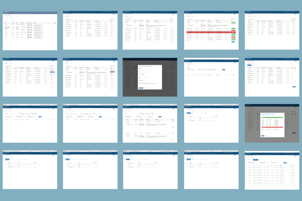
By partnering with UTH users, we identified 2 roles that would need to use this system; those who submit, and those who approve the submitted requests. Through collaborative sessions, we were able to iterate on the supplements system. Workflows of this process were created for each and the interaction between the two roles was made into an easy-to-use feature. A reporting area gave exportable spreadsheets for those who required them in the hospital.
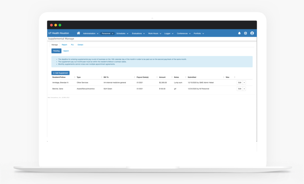
Manage
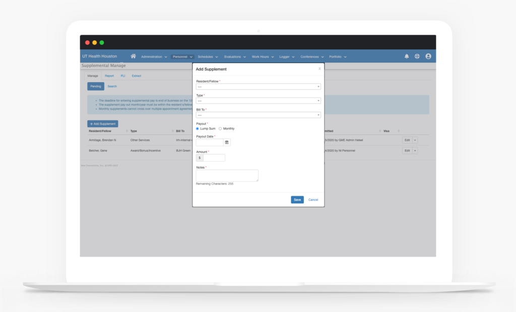
Add Supplement
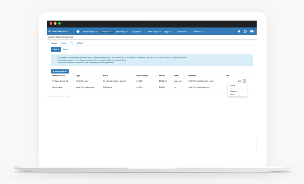
Approval
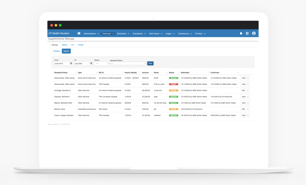
View history
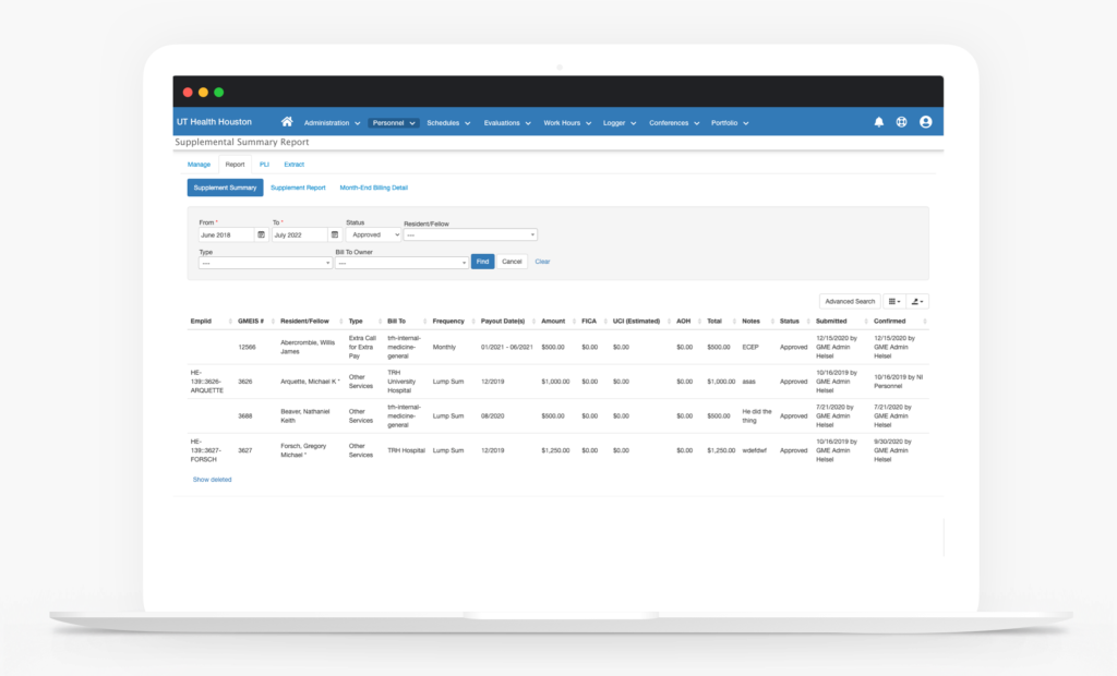
Report
Through experience workshops, iterations, and communication, we created a system that is intuitive and easy to use.

Residency is a step in time of helping residents grow in all aspects of being competent and effective physicians. To aid in this process, governing bodies have developed systems of assessment for core abilities in the general area of being a physician as well as in the specialties physicians desire to practice. Feedback from attending physicians and the ability to see their learning trajectory is it is essential to their development. We need to create a system where; 1. Residents receive immediate feedback in the workplace via a convenient endpoint that endures the environment they are in, 2. Residents and Faculty can view past assessments for feedback and learning, and 3. See and compare Resident progress over time ( quantitative and qualitative ) in order to make good competency decisions.
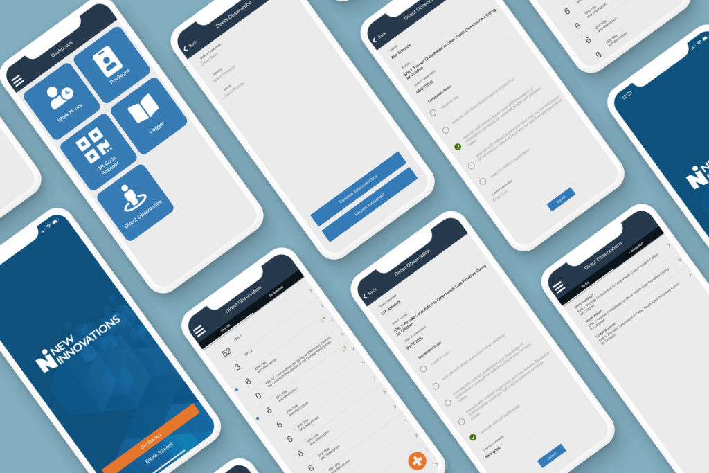
Create a system in the mobile app that brings in Entrustable Professional Activities (EPAs) assessments so they can capture feedback in real-time or request it by quickly pulling out their mobile phone. Allow the user to easily select the EPA related to the medical event that just occurred and the assessor who was with them. The first step in this system is the management and delivery of EPAs for the program.
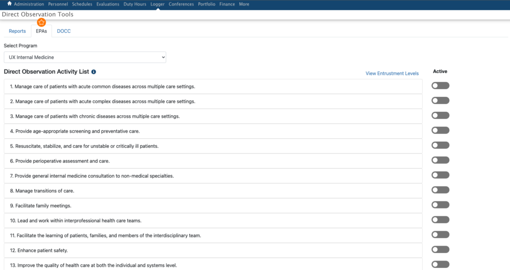
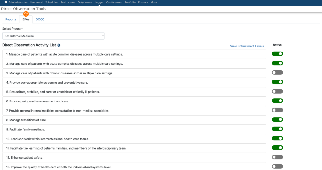
Administrators for the programs have control of which EPAs are delivered to the residents and faculty for assessment. The software gathers the EPAs from the specialty’s published site. Those EPAs are displayed with a toggle to turn them on and off. Once on, those EPAs are available for assessment.
Administrators View
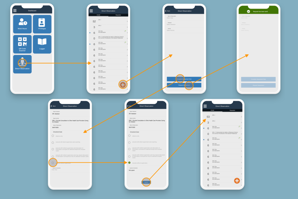
For the Resident experience, the solution needs to accomplish the following: the ability to create/initiate an EPA assessment, and show an overview of the EPAs associated with their program (which typically range from 10 to 20 of them depending on their program’s set up), how many of each have been completed, details of those completed so they can assimilate the feedback, and be aware of EPAs that they have not been assessed on so if one were to occur during their shift they could make that request.
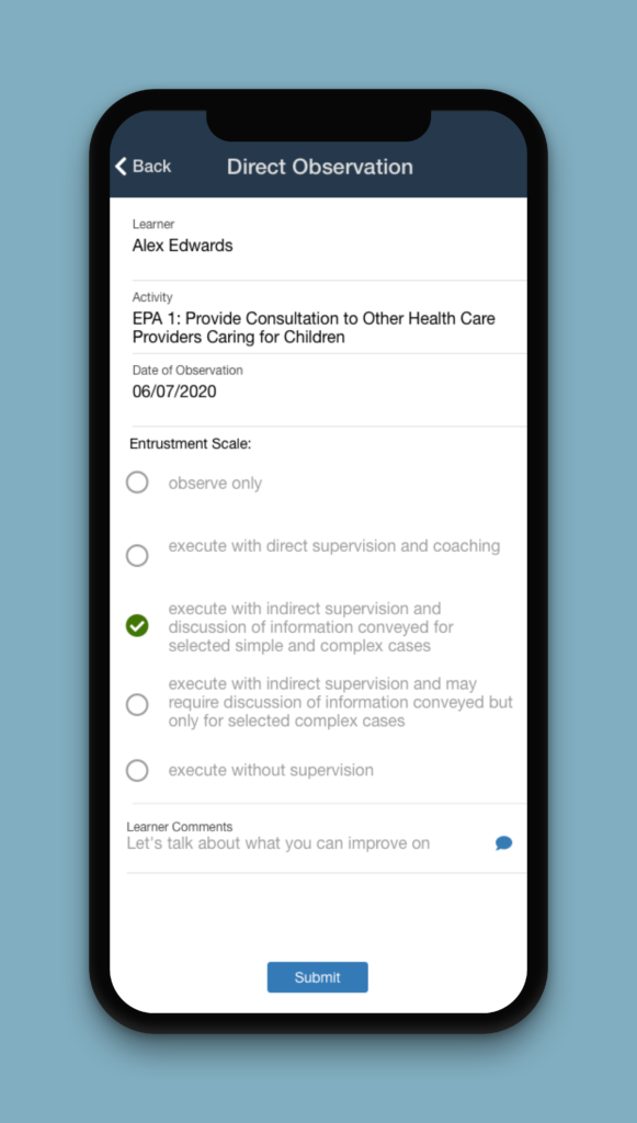
For the Faculty who will be doing the assessments, it will be the first entry point for the use of the mobile app and the beginning of the experience tailored to the journey of faculty of a residency program. Starting simple with the focus on requested assessments. Faculty will be delivered a task list of requests and the ability to view those they have completed. Next, the option to initiate an assessment in the same way the resident would with the difference being selecting a resident and not an assessor.
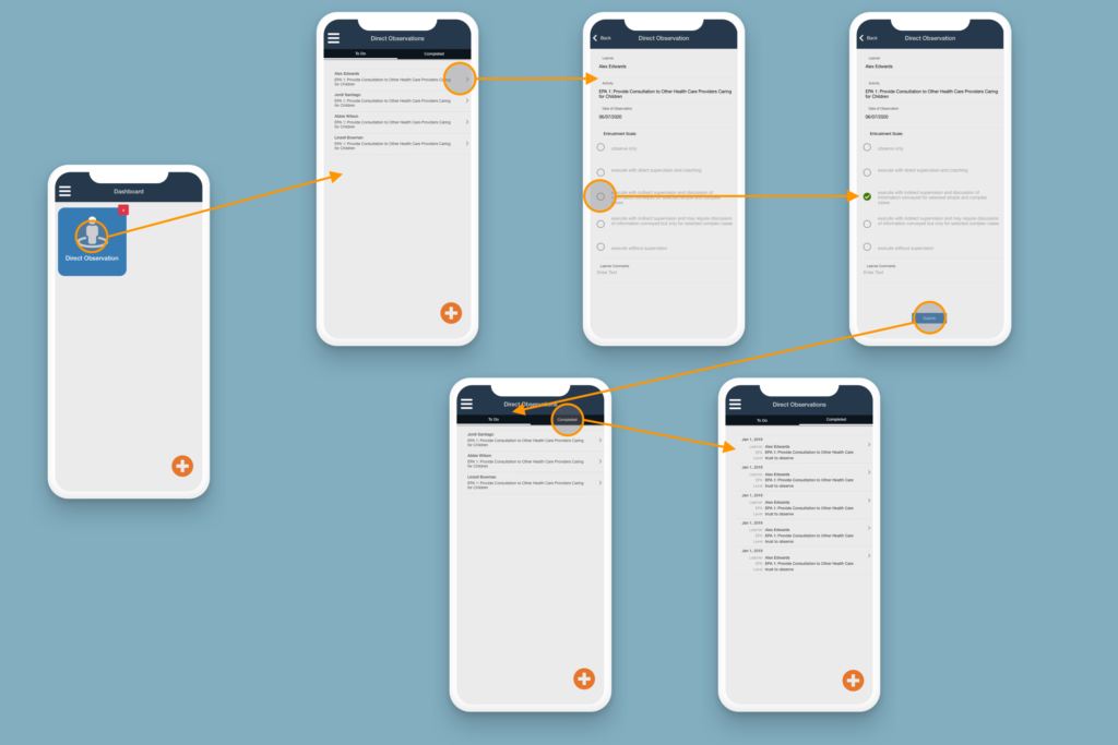
Assessment View
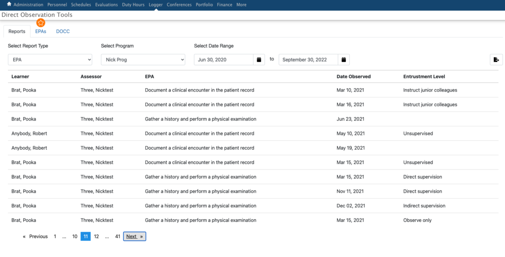
The administration needs to be able to track the residents’ progress in their programs. A reporting tool was developed to aid in this process with the ability to export for sharing. It gives them a comprehensible view of all of their residents’ assessments.
Reporting View
This system, Direct Observations, created a foundation for residency programs to move into as they journey into Entrustable Professional Activities for specialties that are standardizing assessments to better facilitate the education and growth of residents. Feedback is essential in the growth of any person, the improved process for a resident is not only beneficial for them but also to all of us as they dedicated their lives to help.
The ACGME, a governing body for residency programs, sends out an annual survey to residents and faculty to assess the health of the programs they belong to. How can we assist the Graduate Medical Education administration see their programs’ health at a glance? Can we help them see trends in the data year to year
so they can make corrections to the programs if needed? Or see the success of a program from the compared data and apply that program’s processes to the rest of their programs?
Create an easy-to-use system within the software suite that takes the ACGME excel file downloads of the program survey results and presents them to institution administration that can show trending, areas of concern or success, and data visualization. In research, we found most users had some method of doing in a very laborious manual process such as entering the results in an even larger spreadsheet that made it difficult to see trending and little to no visualization. By taking away that manual process we allow their focus to be on what they can do with the results to assist in creating the best for their residency programs and the hospitals those programs are affiliated with.
The system needed three key items to be effective and valuable for our users. Users need to be able to: 1. Upload the files, 2. See the data of the file displayed in a consumable way, and 3. Set thresholds of acceptance of the results for the programs so growth could occur.
In our research and working with the ACGME, we were able to have sample excel files of what each program downloads every year. The file name carries information that we are able to use to our benefit to lessen the burden on the user during the upload. We could handle the year, program, and survey type- resident or faculty. With this being a new feature, getting years worth of the files into the system was fundamental so the upload needed to handle as much as the user wanted to put in at once. After all, the more uploaded the more value could be gained for the program. And having a fail-safe of showing a warning of discard or replace if the file already exists allows the feature to build trust with the user.
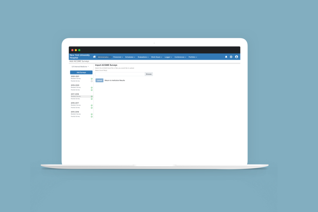
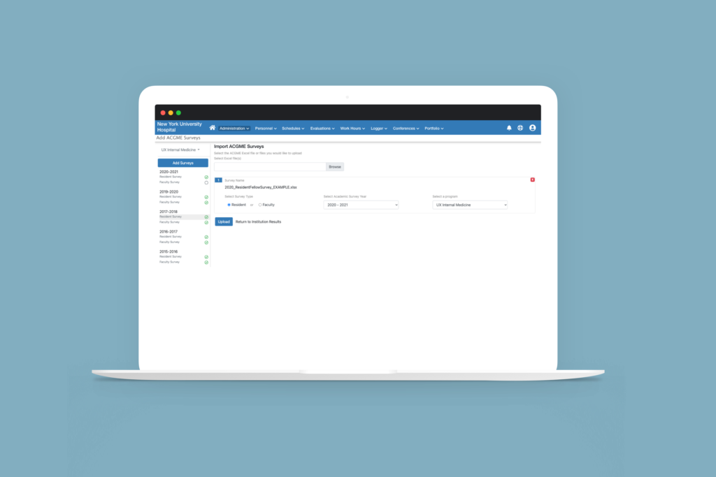

Displaying the amount of data that was contained in the file in a consumable way took many iterations to get to the final result.
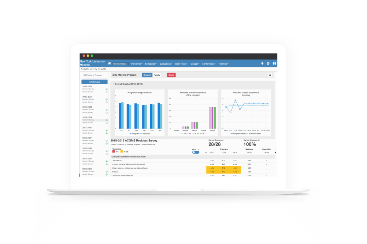
We researched what would be of value in showing as charts and graphs for the programs. Displayed are the overall results of the survey. Placing these at the top gives them instant orientation to the survey results and allows the user to dive deeper into the data in the tables below.
The surveys contained categories of questions with each having a means or percentage value while also showing those values for national and specialty. To achieve this, we created a table containing each category as the header with the overall values and the questions and their values under them. To show trending, the prior 2 years’ values for each category are displayed in columns next to the current year’s values. If the user wanted to see years prior to the three years displayed, we provided an arrow to move back and forth through the years that have been uploaded. To address the preference of the user wanting the means or percentage value we gave them the ability to toggle between the two.
This display of survey results is needed for both types of surveys- resident and faculty. Using a toggle of residents and faculty a the top allows the user to stay in one place to consume all the information they desire.
Lastly, there are two levels of viewing these results. A user can oversee just one program or they can oversee all of the programs. We named these the Program View and the Institutional View. The Institutional View is a high-level view that gives the user the overall results of the survey categories, shows where concerns with the programs are, and manages what programs may be in danger as well as which programs have uploaded their results and who have not. From this page, the user can navigate to the program’s view to get more details.
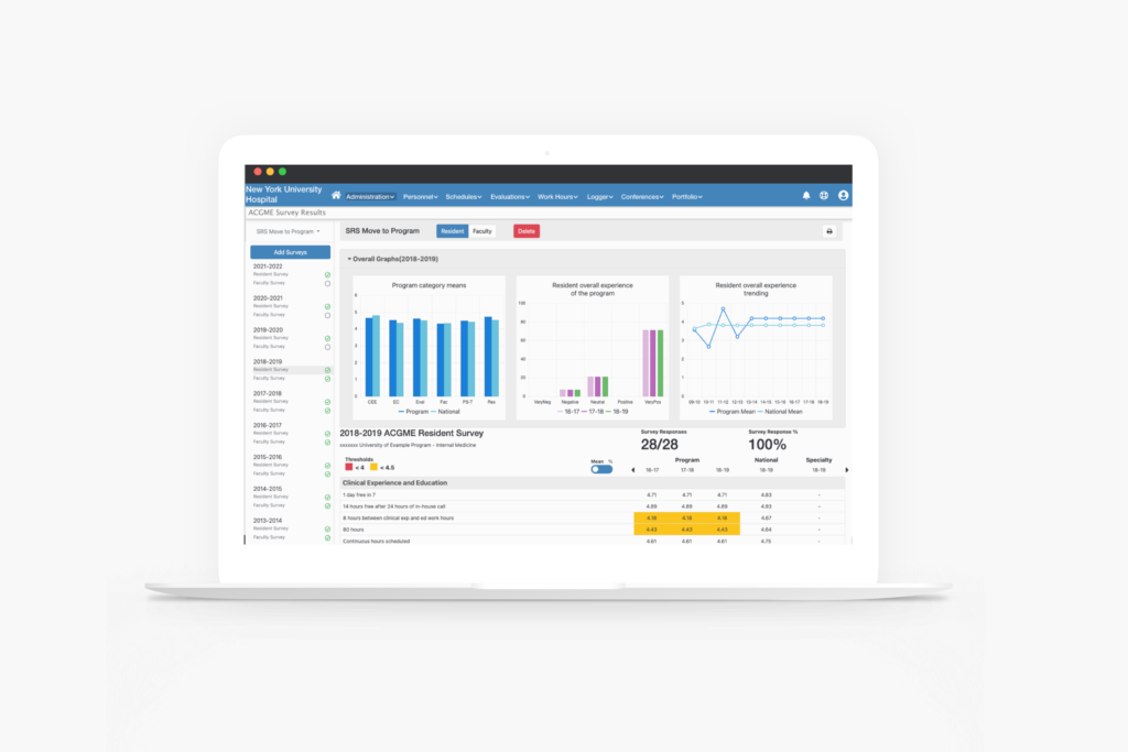
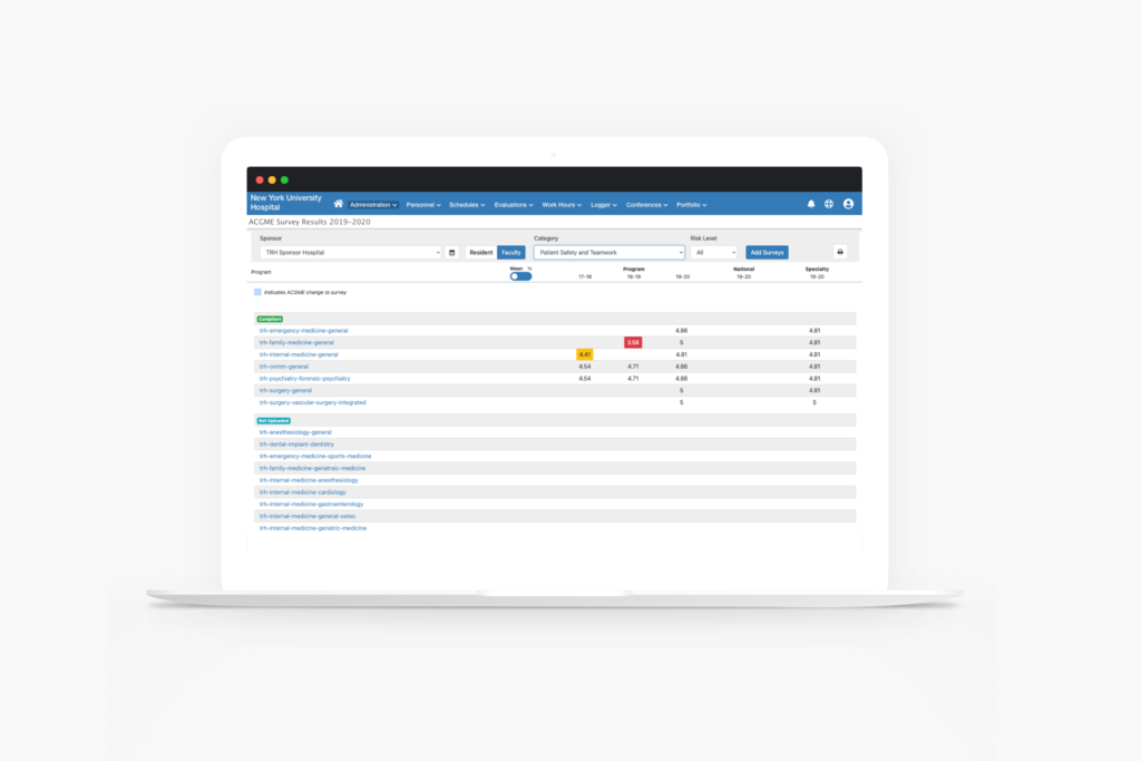
In order to set a level of success for an institution’s programs, we gave the users the ability to set thresholds for that success. This gives meaning to the data displayed in an easily recognizable visual cue. By using a yellow for warning and a red for danger, we allowed the user to set the threshold for each of the two once a means or percent crossed that line into to each respectable territory. If those values fall into those territories, blocks of those colors will appear on the tables on the display page.
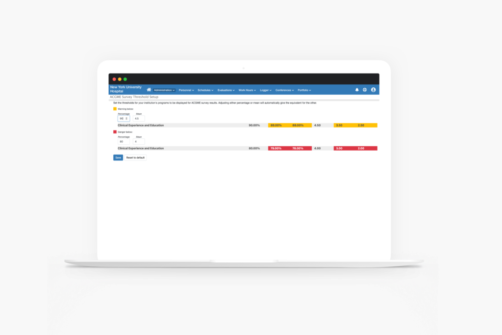
With the first release, a campaign for the feature was sent out to a sample size of 36 customers. 28 of them had started using the feature with 496 files uploaded across 159 programs resulting in an adoption percentage of 77%. By building this feature as a system, we set a foundation to add more value for the users as more and more use it.

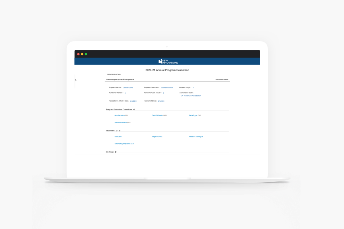
The Annual Program Evaluations set out to evaluate the health and education effectiveness of the programs of an institution. These evaluations help to discover where programs are doing well and what needs to improve based on the evaluation question created by the institution guided by the requirements of the set by the governing body, ACGME, to remain in good standing. With a handful of requests of copying the evaluation from the previous year, we set out to understand why customers would want the same answers every year and what we could do to accommodate the request.
Up first was to research the experience of completing the Annual Program Evaluation in its’ current state in our system as it was built before I joined the company. I looked to those of the clients who made the request. Upon opening the form, I found they were taking a solid 90 seconds to even open, not the best start to an experience. The evaluations had 60 to 100 questions along with additional sections of data for those who completed them. The question response type could be numeric, yes/no, and written responses. We already showed the previous two years’ responses but not for written responses. If the user wanted to see those, they would need to exit the evaluation, navigate to that evaluation and open it(adding another 90 seconds of wait time to load). Find the information they desired and then navigate back to the current year’s evaluation. That process alone gave great insight into why they would want to copy the evaluation.
With this knowledge in hand, I set up some interviews with those users that requested to understand their pain points. It was confirmed that was the biggest pain point. What the true problem boiled down to was pure human factors and having enough information available to them to give a response to the question. This changed the challenge from copying the evaluation to providing information to give a response as well as tackle the load time issue.
I brought the load time problem to my outstanding engineers who quickly got on the problem as they could not believe the page load time either. Within a day or so, they had the load time down to mere seconds. Next, I created an addition to the UI so users could see the previous year’s response and copy it if they needed to. I was also able to make a few visual changes to make the experience better. Before we built, I presented a prototype to those who made the copy requests. The solution we created was “even better than just copying the evaluation” one user said because still makes people think about responses instead of signing off on what someone responded the year before. That in turn helps programs progress in their education and not stay stagnant. We proceeded with the build.
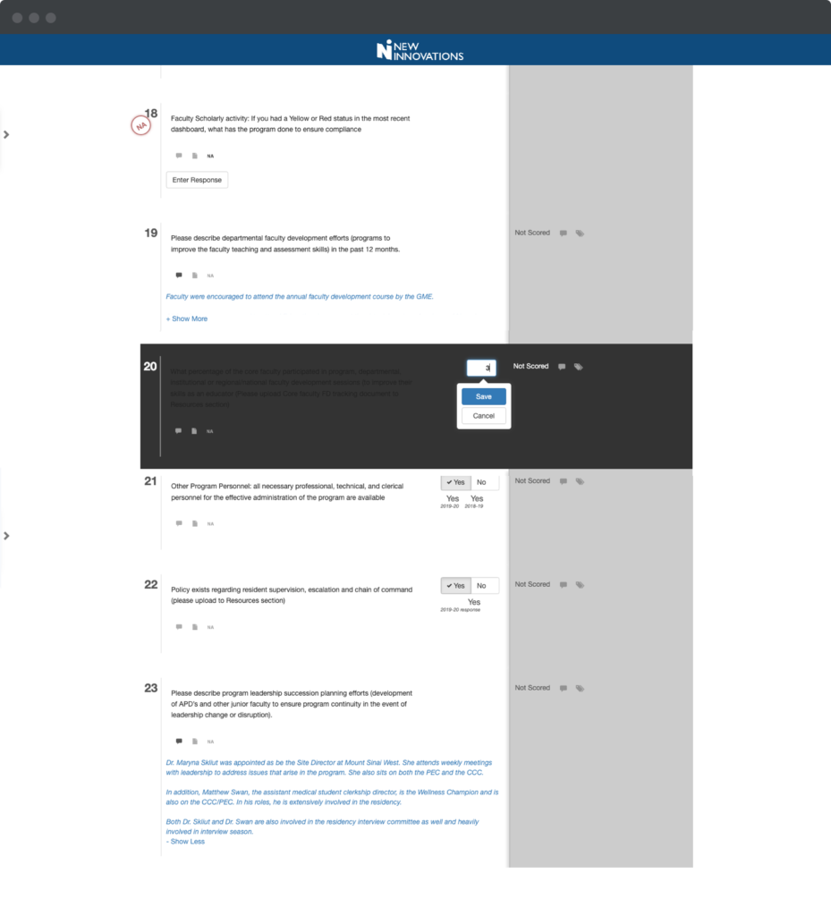
Previous way of entering a value for a question. THE Question was not readable and prior YEAR’S values were covered by the save or cancel button.
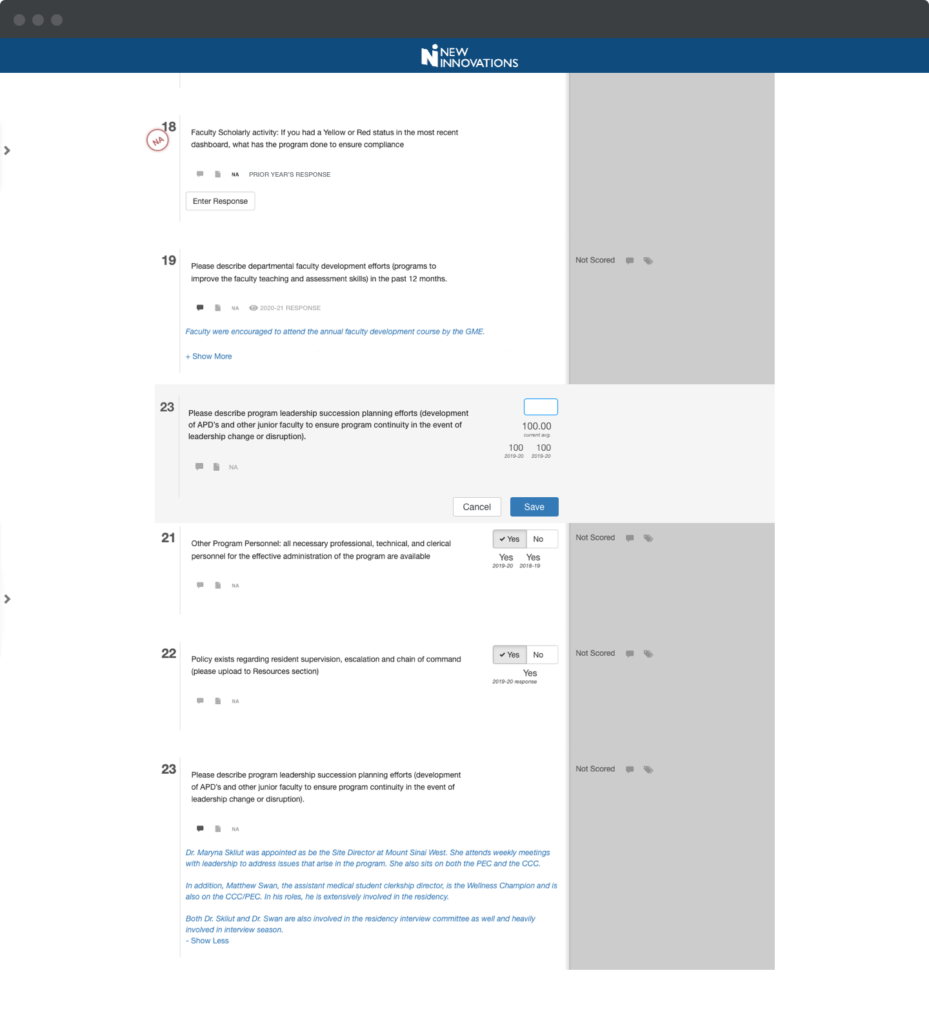
Revised way. The question is now readable to show all information needed to enter a value.
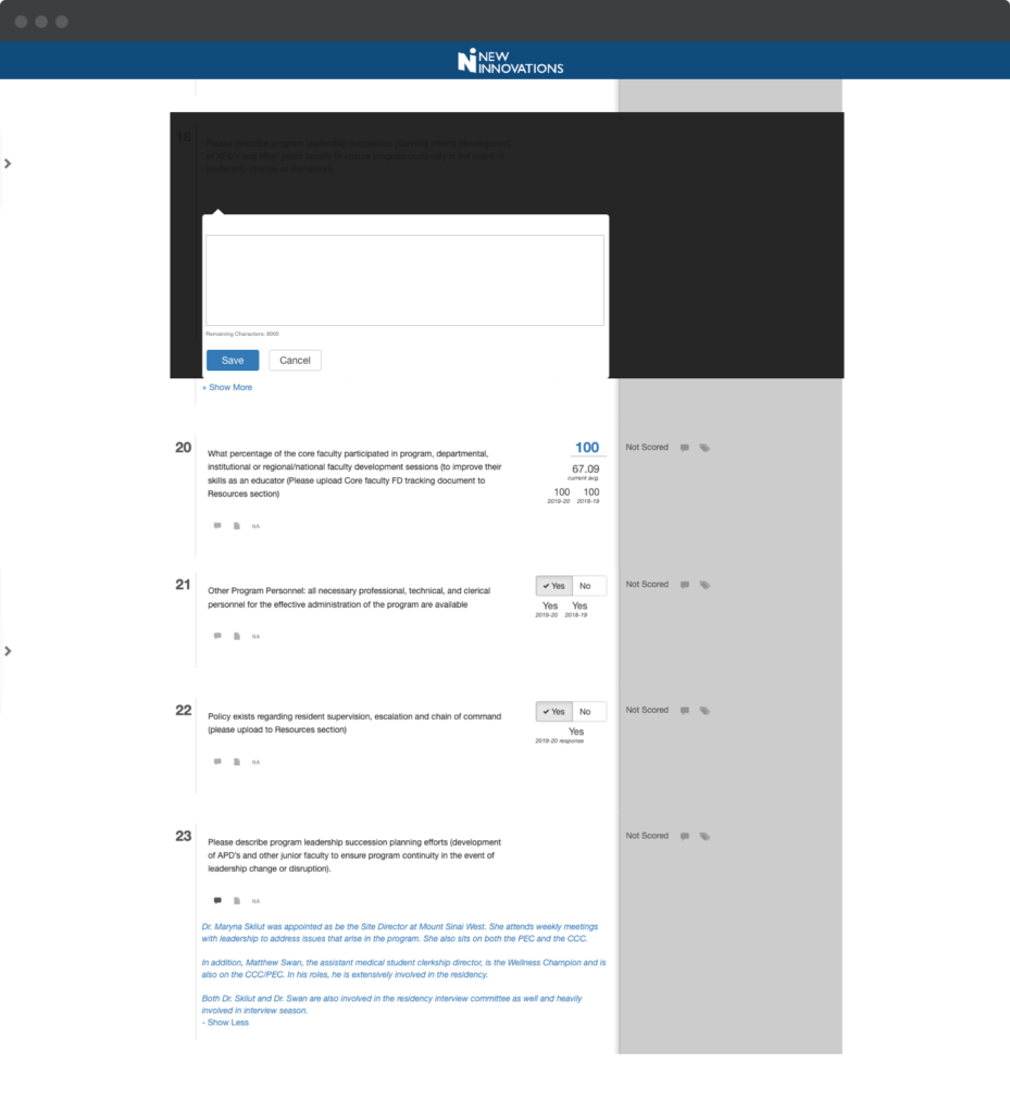
Previous way to answer a written response question. Again, THE question WAS not readable and there wasn’t a way to see the previous years written response.
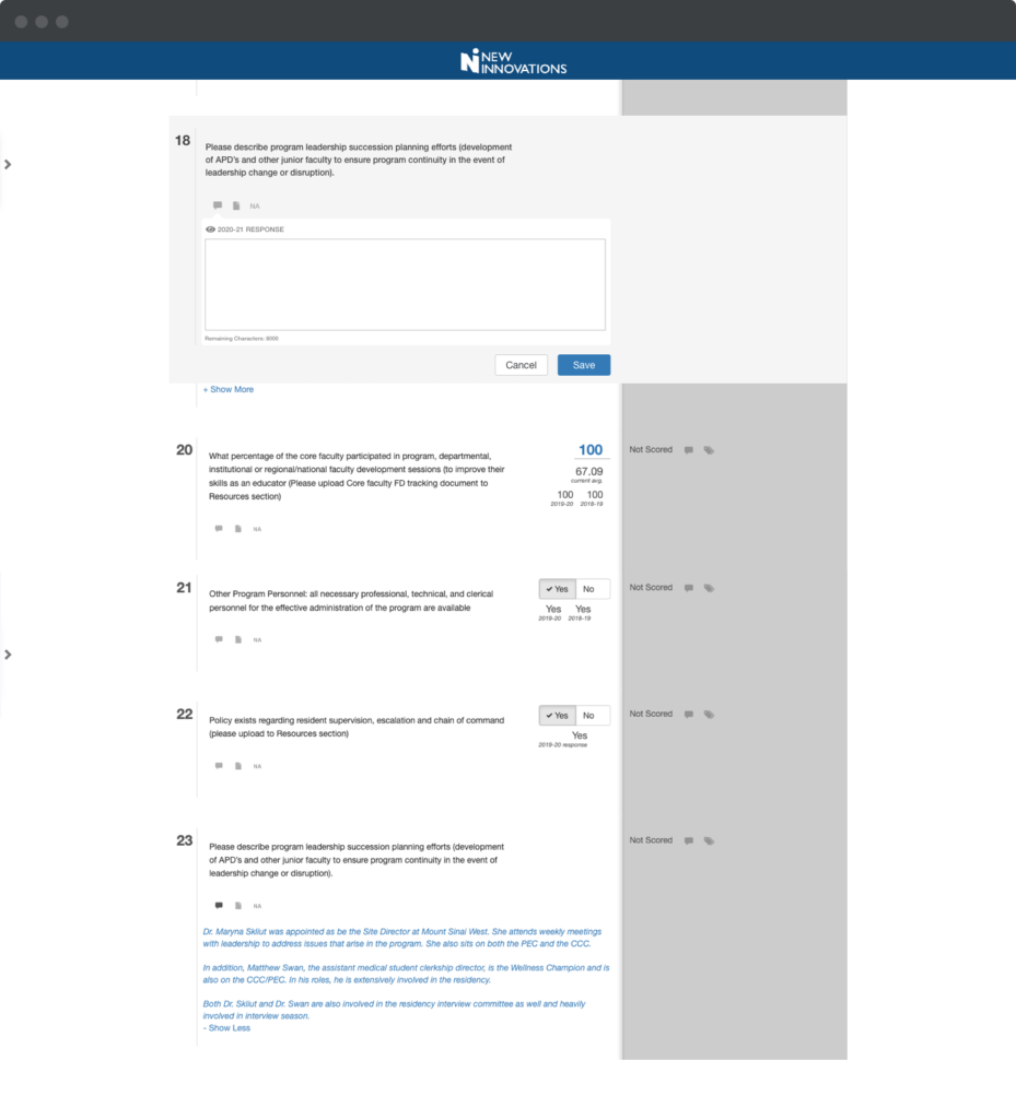
the Questions are now readable and HAVE an option to see the previous year’s response.
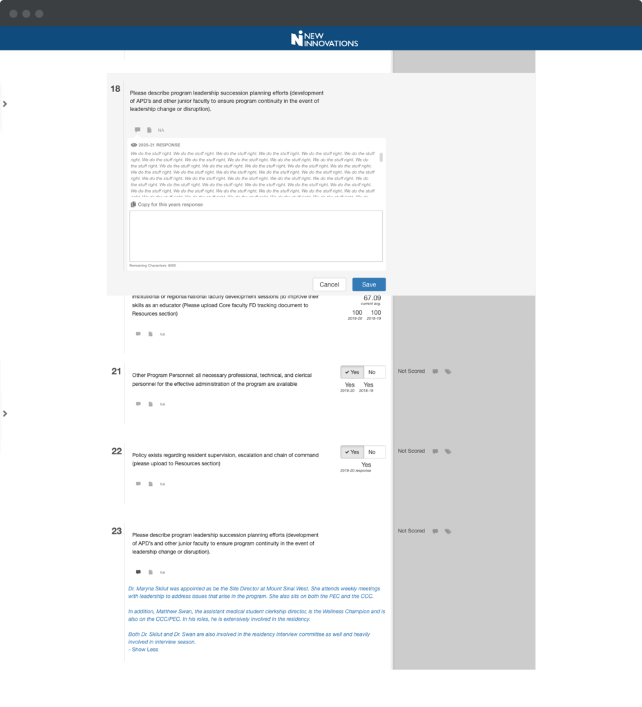
THE Previous year WAS displayed.
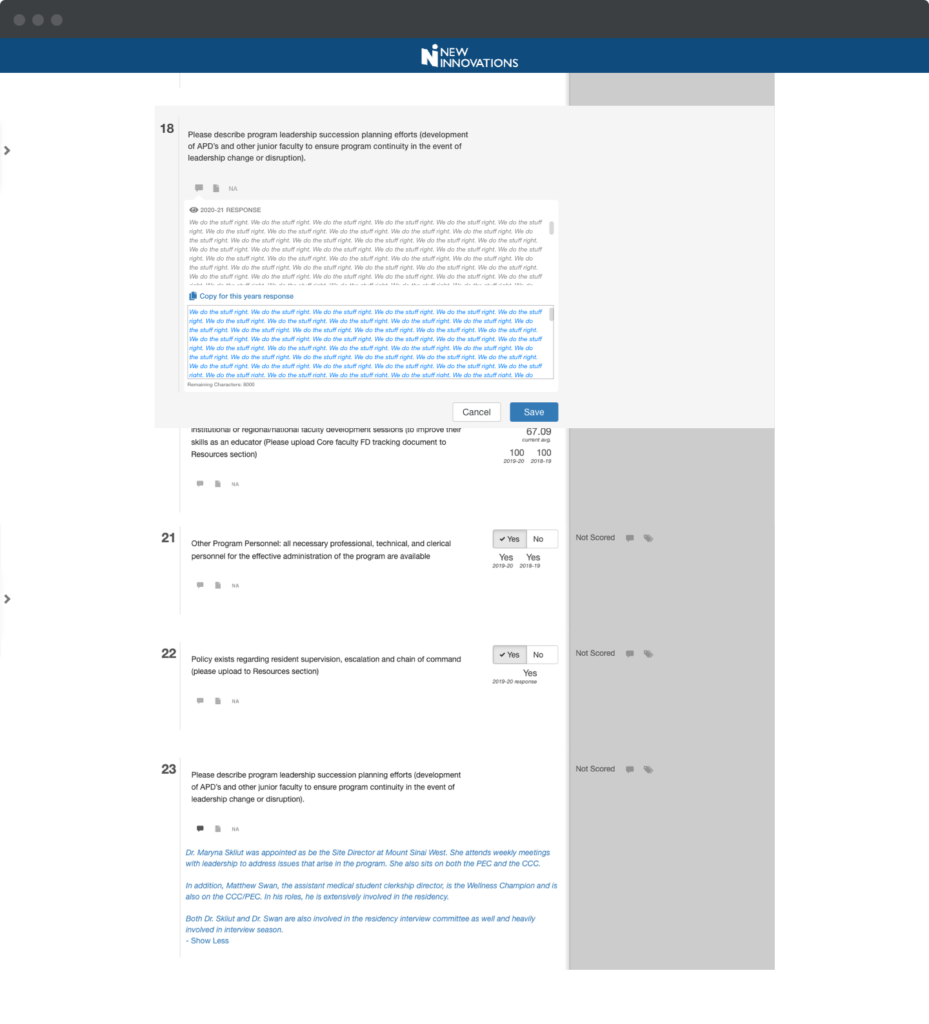
Ability to copy response and use with one click.
Initial reactions have been very positive. The evaluations are still in progress. User interviews and a CES will go out in the fall for further effectiveness measurement.